Note: This image was created using Dall-E with the prompt "A child riding an oversized pencil in the style of surreal, digital art" on December 2, 2023. I know Andrea Sykes showed us how to do proper citation for AI generated texts, but I'll get better at it in 2024, I promise.
D2.2 - this is the expectation code that caused the most commotion when the updated Ontario Language curriculum was released in June. For Grade 2s, it says:
print legibly and fluently, with appropriate formation patterns, size, placement, and spacing
For the Grade 4s, this same expectation says:
write in cursive, forming letters of appropriate shape, size, proportion, and slant to improve the legibility of texts, and begin to develop fluent keyboarding skills using touch-typing techniques
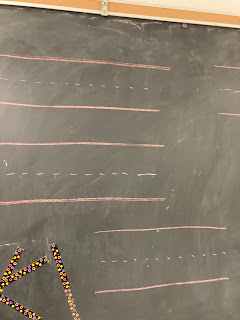
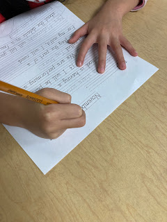
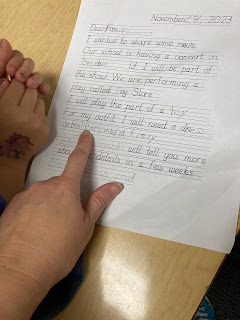
How do you fit in this type of instruction, along with all the other requirements of the curriculum? Last week, I decided to conduct a "one-off" lesson on printing and handwriting techniques in conjunction with my drama focus. We are preparing for the big concert in December and I wanted to communicate with the families about what outfits the students would need for the show. To "kill two birds with one stone", I elected to create a fill-in-the-blank letter that would allow students to practice printing or writing while paying attention to all those criteria listed in the new expectation.
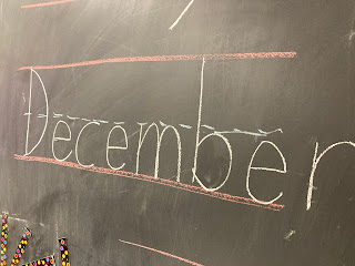
A very long time ago, I purchased a CD-ROM (!) that provided several kinds of printing and handwriting fonts with lined backgrounds. This made generating my letter template easy.
I took photos of every student as they wrote their letters. One reason was to note their pencil grip. Another reason was to capture evidence of their printing or handwriting results. The third reason was to eventually add some of these photos to their BrightSpace portfolios, with a short audio reflection by them on their thoughts about learning to write in cursive or print.
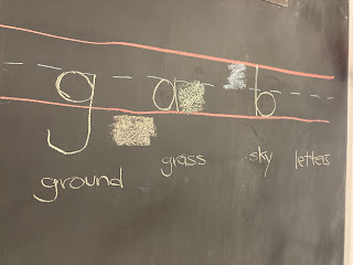
I know that there are certain printing methods or techniques. I did not religiously follow any of those. I reviewed "ground", "grass" and "sky" letters so students would know where on the lines to place the letters.
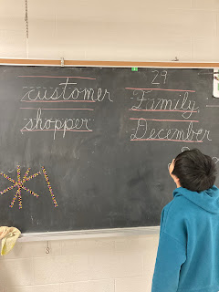
I have to give huge credit to the Grade 3 teachers in my school. Both of them have conducted specific lessons with their students teaching them how to form letters. Honestly, I pushed the students a bit too hard and fast with this task. I asked them to sign their names at the bottom of their letters in cursive and many of them explained that they didn't know how because they hadn't covered those letters yet in their homeroom class instruction! Not quite fair, was it? I modelled a lot of signatures on the board and they all gamely tried to mimic.
I still have a few weeks left in my Media Part 2 Additional Qualification course, and I promised that I would reflect on the media literacy implications from this lesson.
- Key Concept #3 is that audiences negotiate meaning. Who determines what the "best" way is to form a capital letter F? How many people need to be able to decipher someone's handwriting for it to be considered "legible"?
- Key Concept #4 is about economic implications. How many cursive writing primers have educators purchased (or illegally downloaded) in order to teach their students how to "do" handwriting?
- Key Concept #5 centers on value messages. What does neat handwriting "say" about a person? Did this value judgement get lost when educators stopped teaching handwriting? Will this connection between student and print quality return? Why do students have to learn about printing and writing in cursive when keyboarding skills are also required starting in Grade 4? Which skill set (typing using touch-typing methods or printing) is more important?
- Key Concept #6 focuses on political and social messages. What cultures or languages might have an advantage when learning to print or write in English? How does the technology of ink influence the attention to handwriting? How does it connect to calligraphy? When do we switch from all being able to print the same to the evolution of our own individual, unique signature? How important is it nowadays to have your own signature? What occupations are known for their terrible handwriting vs excellent handwriting, and why? When will the Ontario Ministry of Education finally release the examples for teaching these various expectations, including D2.2?
- Key Concept #8 looks at aesthetics. What is it about cursive writing that appeals to some. How does a nicely printed letter compare to a well handwritten letter?




Love, love, love all of your questions! Amazing! And oh yes, friend. I started teaching when every primary classroom featured perfect printing on the board and a piano that got used every day. I miss the pianos, and the solid musical knowledge base it gave students.
ReplyDelete